Driving innovation.
In all directions.
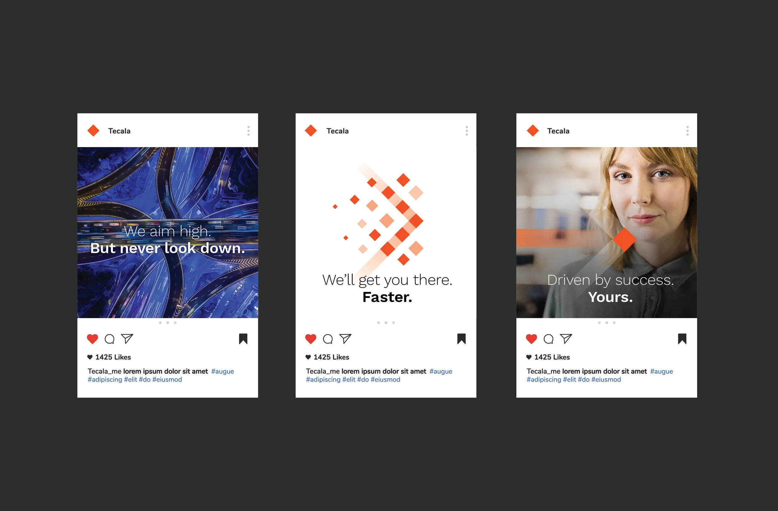
Tecala is an Australian IT company offering technology services and solutions to businesses. Central to the rebrand was the Tecala square, which has always been a feature in the Tecala logo (originally as a floppy disc!). The square was used to create a suite of illustrations to hero Tecala’s brand idea “Accelerating Brilliance”. The rebrand also features an evolved orange/grey/white colour palette which is represented in photography, typography and graphic elements. A cohesive and modern brand system that speaks to the digital world.
Creative Director: Yolanda Koning
Strategy: Heidi Noujeim
Language: Di Powe