Humanising the banking sector
From NAB’s 2014 re-brand, with it’s impactful font and modern photography style, I have worked closely with the Principals team to deliver award-winning design across many touch points from digital applications to in store campaigns.
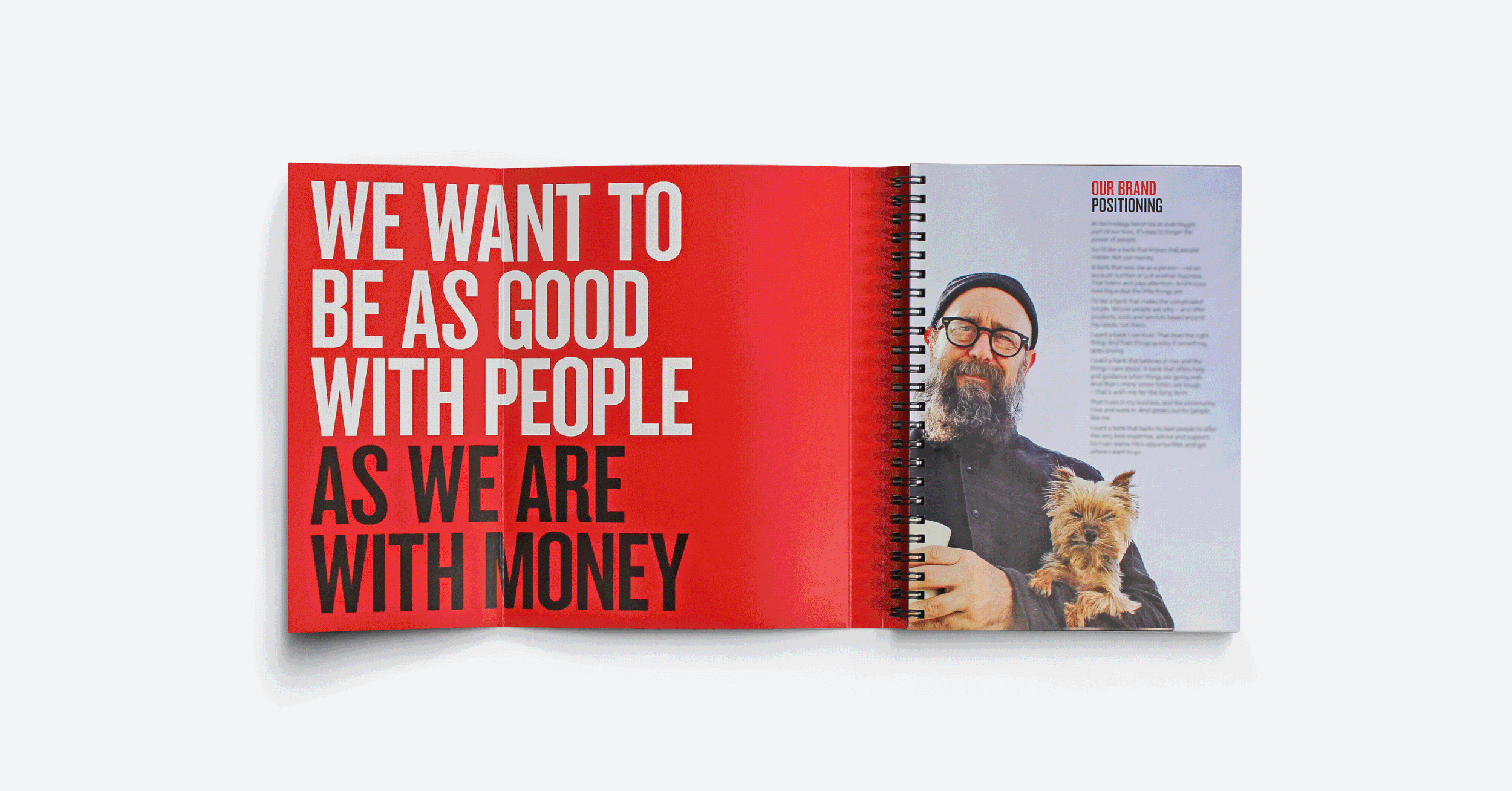
The identity reinforces the bank’s strengths – its strong relationships, empathy and understanding of customer needs. The new identity has a strong focus on photography and different visual treatments were introduced to ensure the photography has a look that is unique to NAB. Changes were implemented while maintaining the strong tone of voice that the brand has been using for several years.
Design Director: Yolanda Koning
Agency: Principals