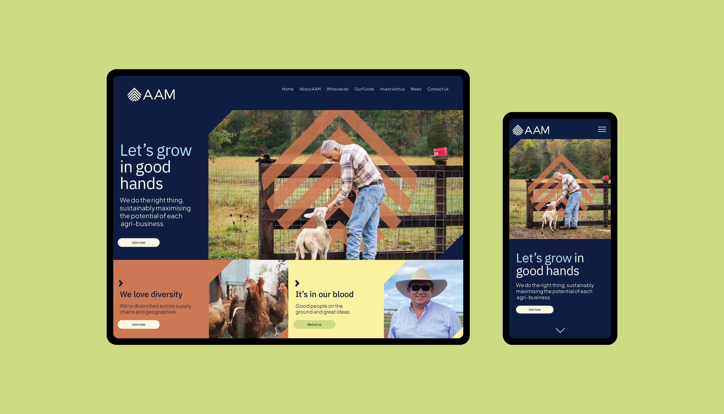
“It’s in our blood”
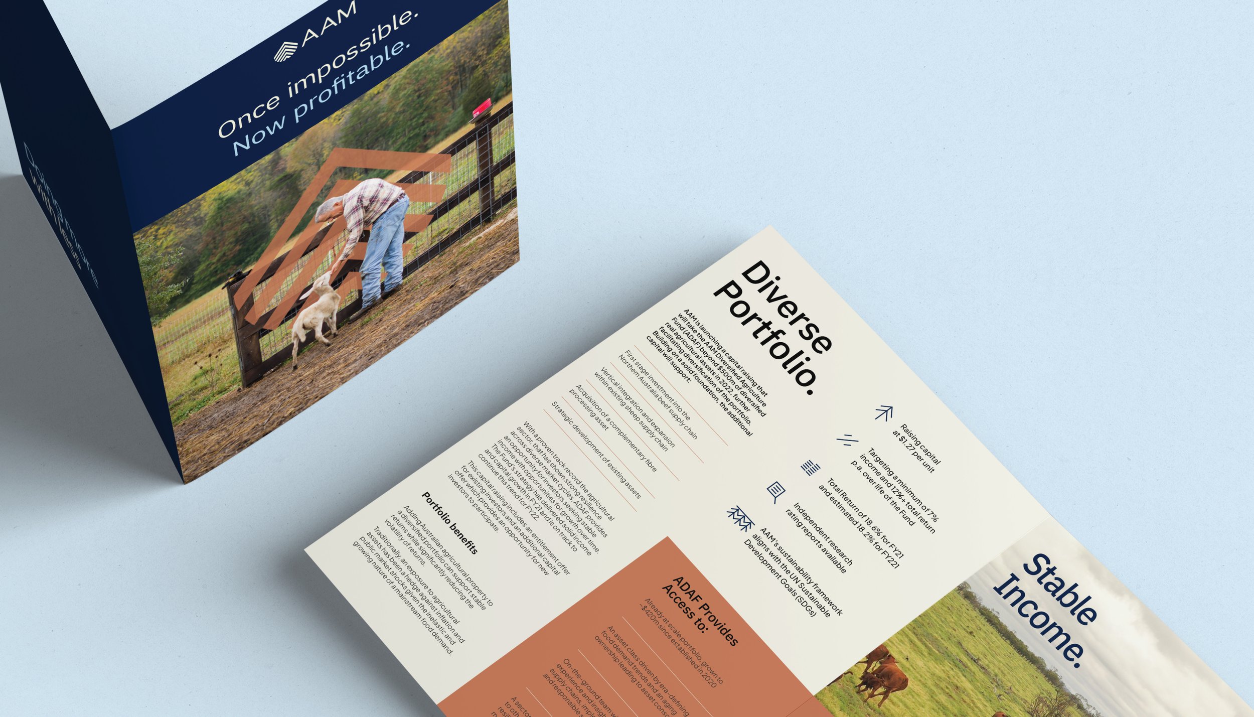
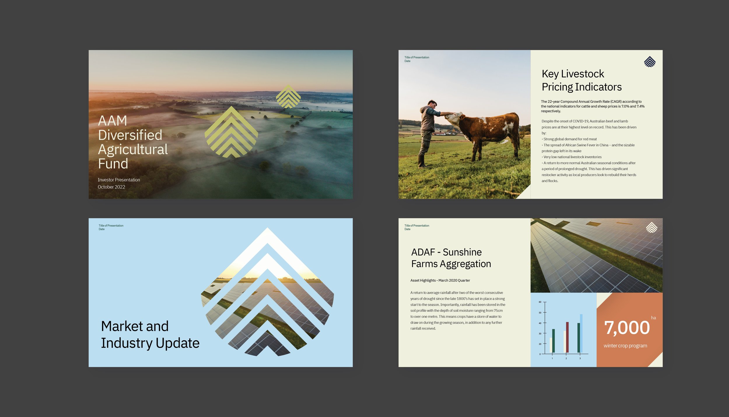
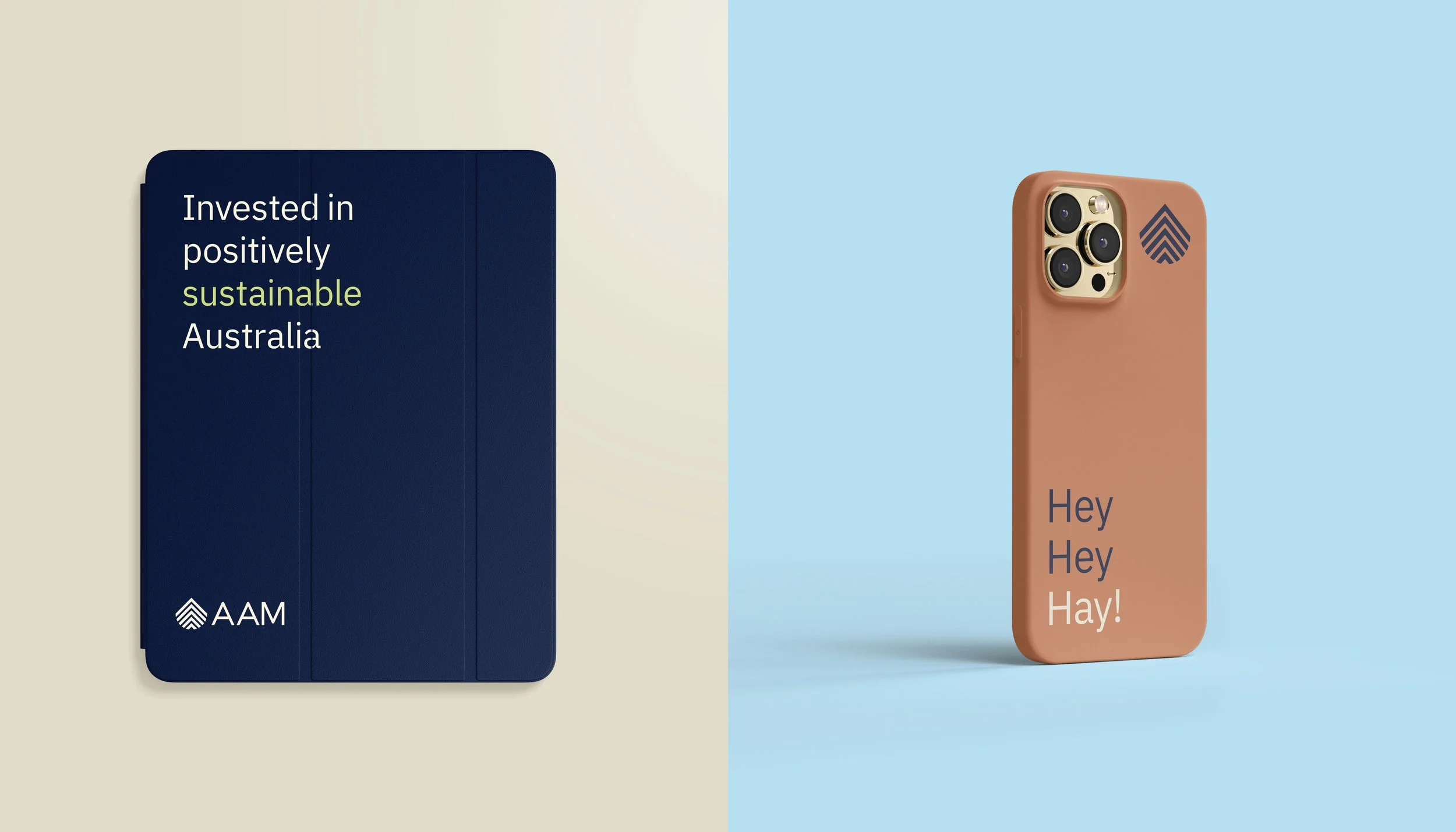
The creative direction was developed around the brand idea, ‘It’s in our blood’. The new AAM brandmark combines the uniqueness of a fingerprint; tree rings indicating history and growth; a drop of water and the boldness of mountains, evoking the topography of landscapes and the passion of AAM people.
The colour palette is inspired by the land, sky and AAM’s values bringing warmth and elevating a simple design system. It reinforces sustainability, without resorting to the typical green palettes that have become pervasive in an era of ‘greenwashing’. It aligns with AAM being an on-the-ground owner/operator, not an at-a-distance investment company.
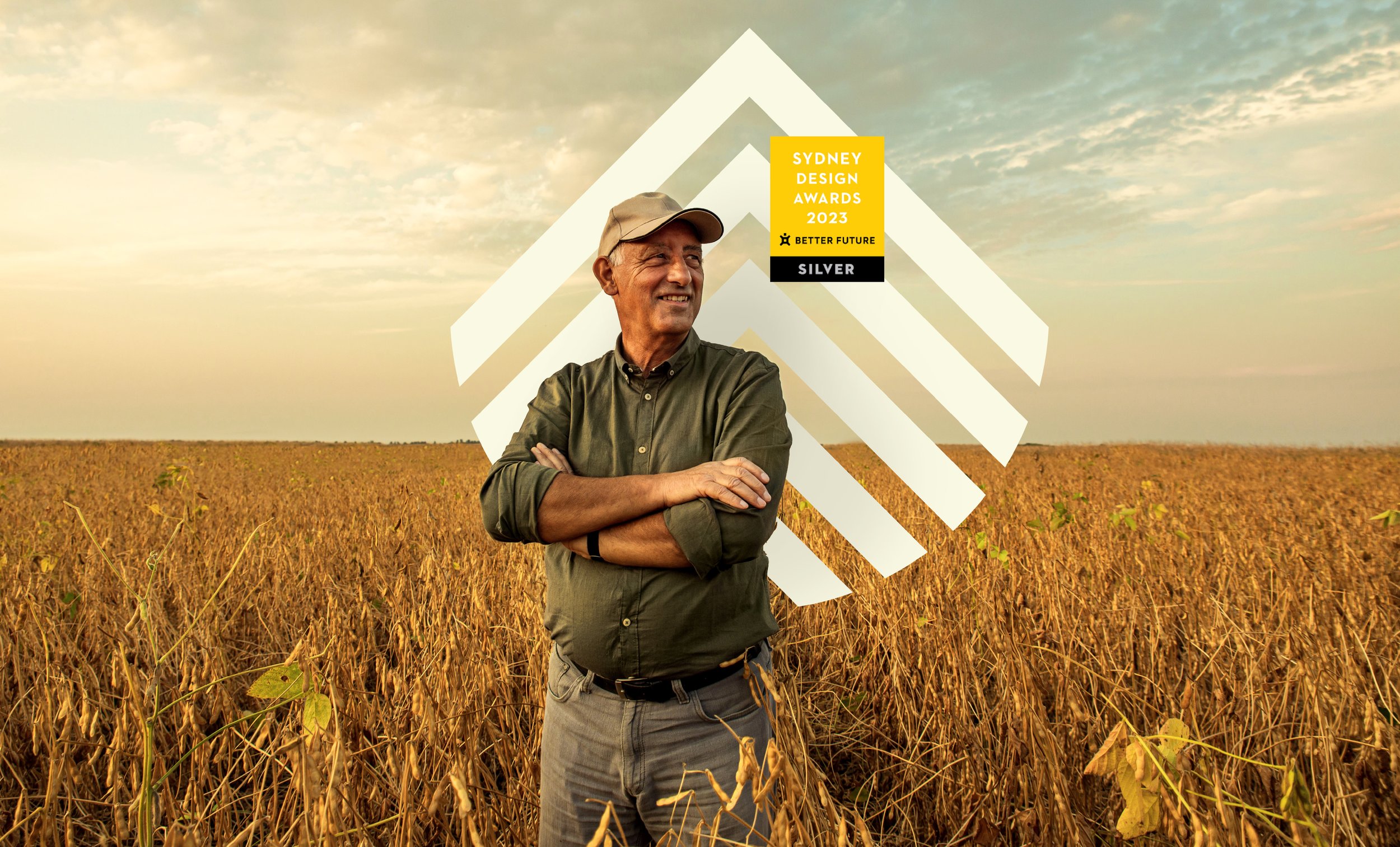
The rebrand won a Better Future Sydney Design Award in the Graphic Design – Identity and Branding – Finance category.
Design Director: Yolanda Koning
Strategy Director: Moensie Rossier
Agency: Principals